
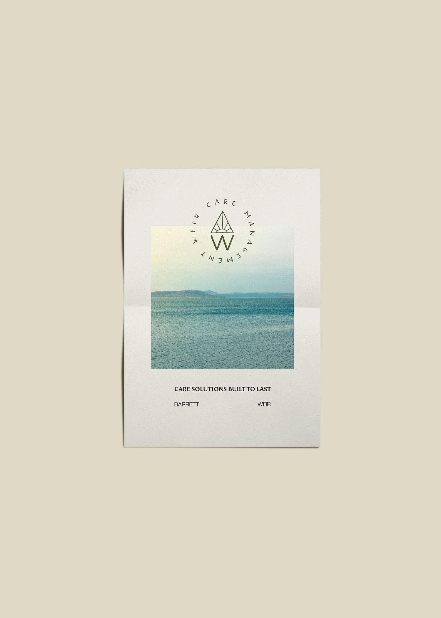
Weir Care Management
Compassionate care management for
dedicated advocacy of people
Brand & Digital Direction
The Weir Care Management website was designed to feel confident, vibrant, and distinctly human. A bold, whimsical color palette sets the tone — energetic hues bring warmth and personality to a space that is often presented as purely clinical. Rather than relying on traditional healthcare blues and grays, the design embraces expressive color to signal optimism and approachability.
Playful graphic elements and subtle curves introduce movement and levity, reinforcing the idea that care management can feel supportive without being heavy. Typography balances character and clarity: a distinctive serif adds personality and memorability, while a clean sans-serif maintains professionalism and readability. The overall experience feels dynamic yet grounded — reflecting a business that advocates fiercely, communicates clearly, and brings heart into complex systems of care.

Let’s create something
that’s yours.
No two projects are the same. If you’re ready for a brand and digital presence
that feels this considered, let’s start the conversation.