
T.O.P. Elite Care
An integrated approach to security, consulting,
and preventative mental health care.
Brand & Digital Direction
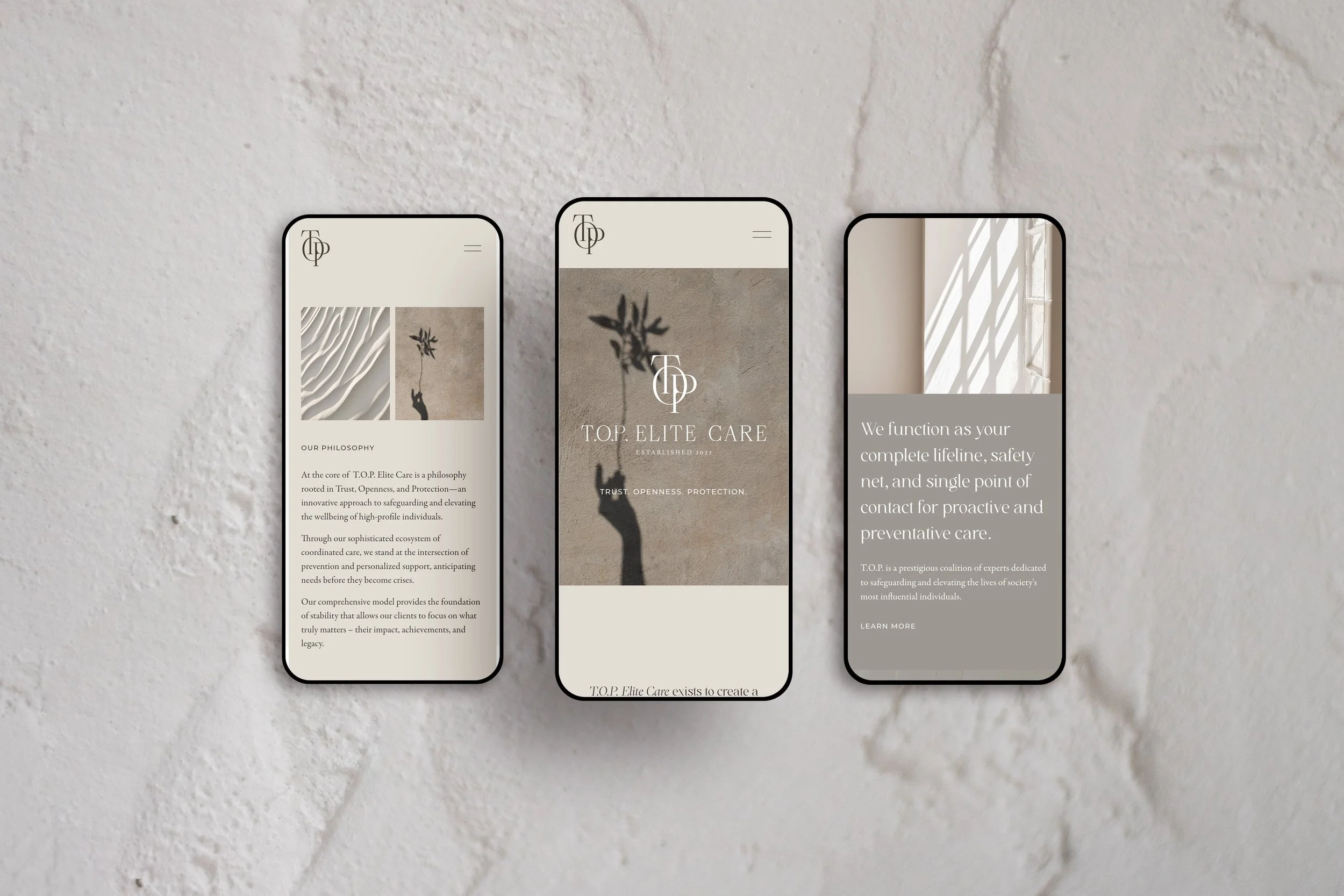
The T.O.P. Elite Care brand and website were designed to communicate discretion, refinement, and quiet authority. A soft, neutral palette of warm stone, taupe, and muted earth tones creates a restrained, elevated atmosphere that feels calm and controlled rather than overtly corporate. The visual language draws inspiration from luxury hospitality and editorial design, using architectural textures, natural light, and minimal imagery to evoke privacy, sophistication, and trust.
Typography and layout emphasize restraint and composure. Elegant serif typography introduces a sense of legacy and prestige, while clean compositions and generous negative space allow each message to feel intentional and measured. Subtle imagery — shadows, natural forms, and quiet interior moments — reinforces the brand’s philosophy of protection and well-being operating seamlessly in the background. The overall digital experience positions the brand as a discreet, high-touch ecosystem of care designed to support complex lifestyles with clarity, confidence, and absolute confidentiality.


Let’s create something
that’s yours.
No two projects are the same. If you’re ready for a brand and digital presence
that feels this considered, let’s start the conversation.