
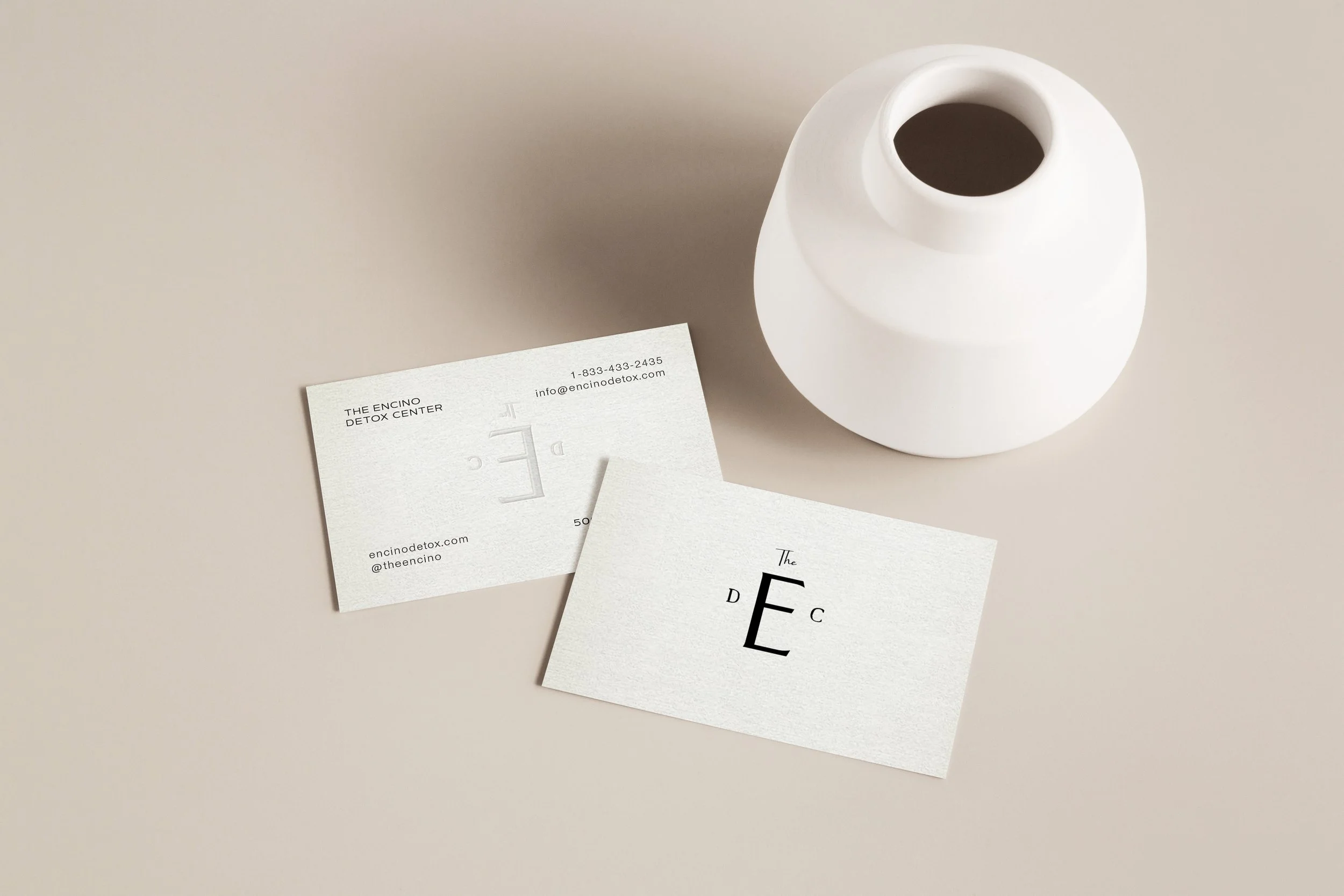
The Encino
Detox services providing safe, clinically supervised
treatment during the earliest stage of recovery
Brand & Digital Direction
The Encino Detox Center website and brand were designed to communicate professionalism, safety, and trust during a critical moment in the recovery journey. A deep, calming palette of navy and cool neutrals establishes clinical credibility while maintaining a composed, supportive atmosphere. The visual direction leans into clarity and structure, ensuring that information about detox services, admissions, and care philosophy is easy to navigate for individuals and families seeking immediate help.
Typography and layout prioritize readability and confidence. Clean, modern type and strong hierarchy guide visitors through the content with clarity, while restrained graphic elements maintain a polished and professional tone. The overall digital presence balances medical authority with compassion, reinforcing the center’s role as a stable first step toward recovery and long-term healing.
Let’s create something
that’s yours.
No two projects are the same. If you’re ready for a brand and digital presence
that feels this considered, let’s start the conversation.