
Eisley Consulting
Expert consultation grounded in compassionate,
transformational care

Brand & Digital Direction
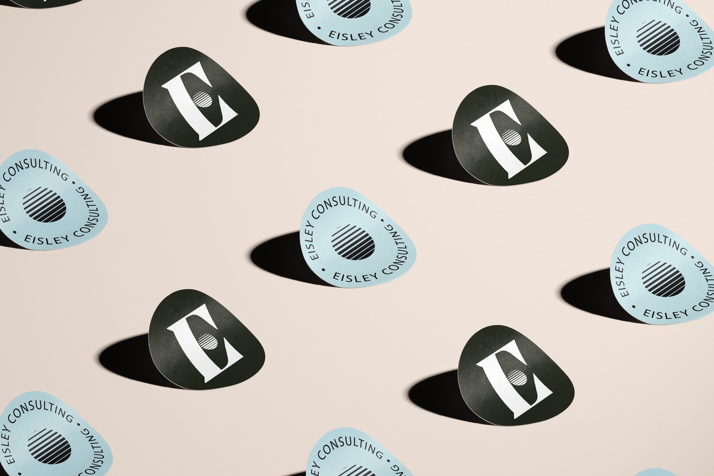
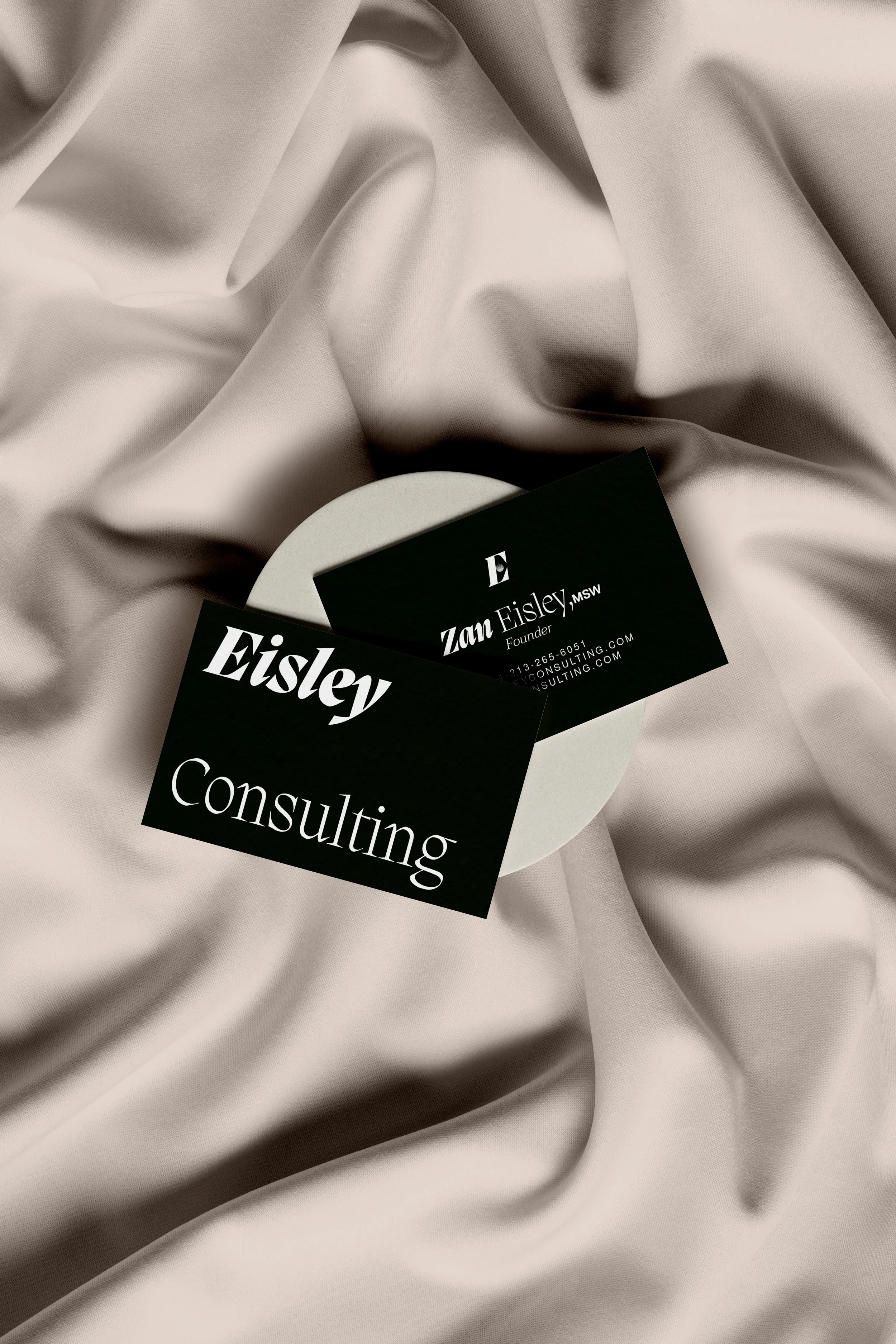
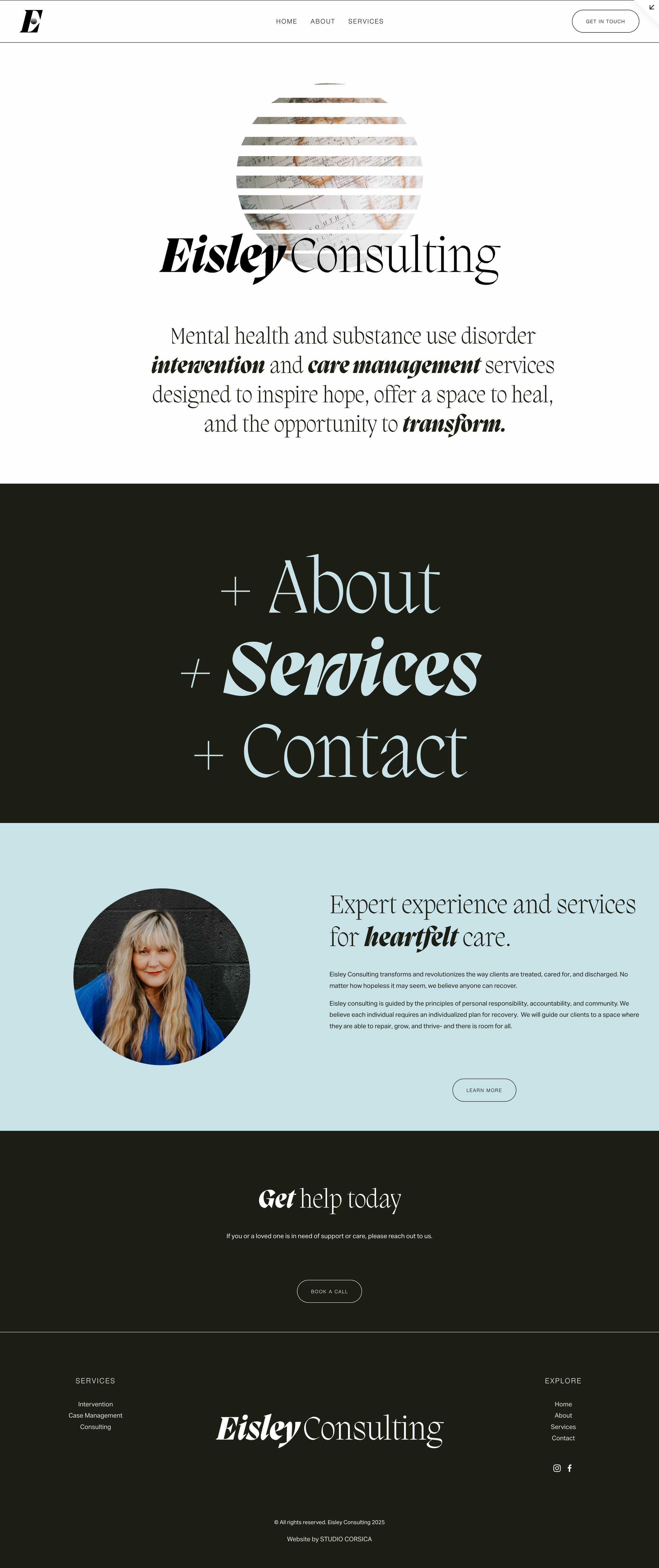
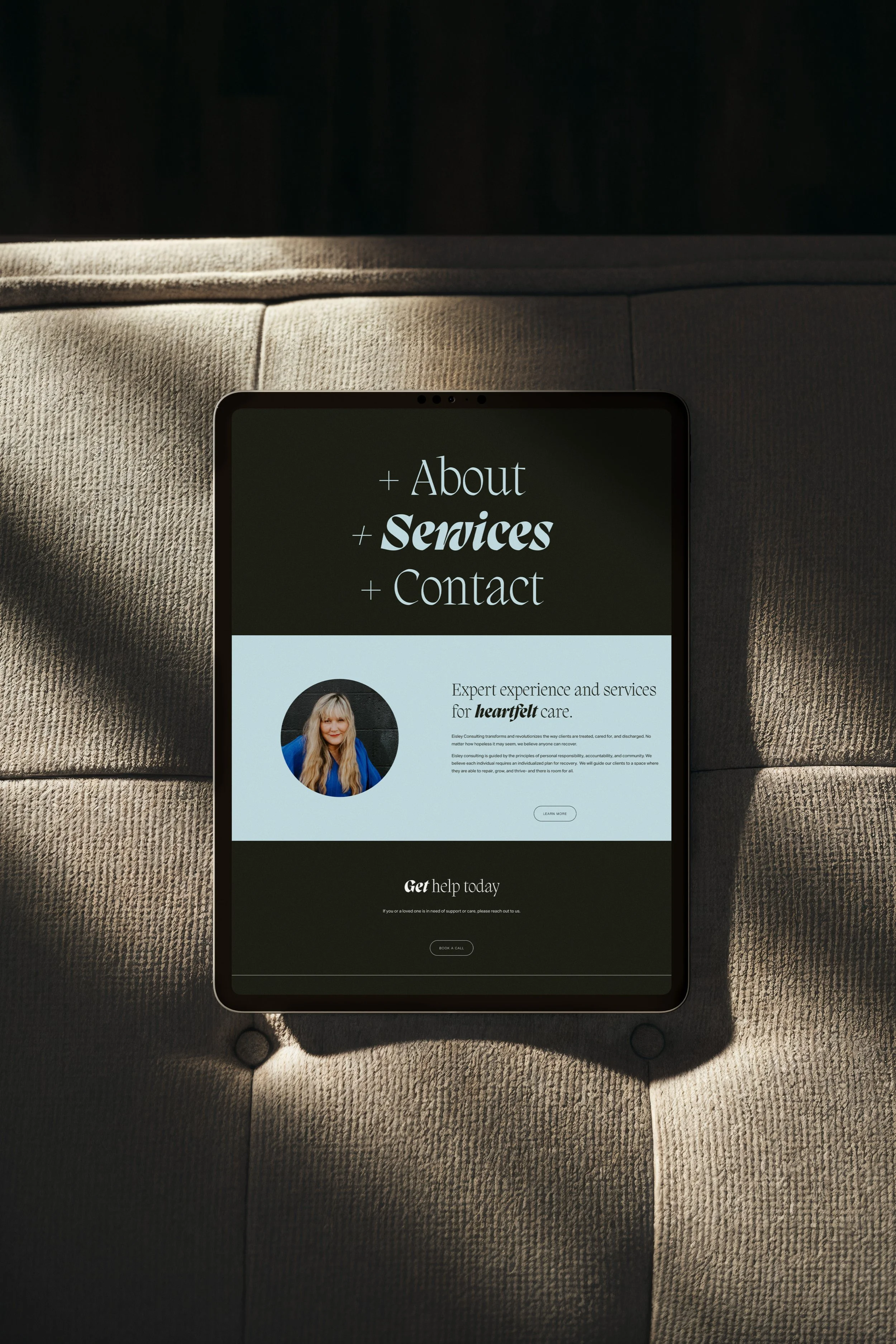
The Eisley Consulting website was designed to balance authority with hope — reflecting the intensity of intervention work while honoring the possibility of transformation. A rich, high-contrast palette of deep forest green and soft blue establishes depth and emotional grounding, while moments of light create clarity and forward movement. The color story feels confident and immersive rather than clinical, signaling strength and steadiness in high-stakes situations.
Typography plays a central role in expressing the brand’s personality. A dramatic serif introduces conviction and leadership, while softer italic moments add warmth and humanity, visually reinforcing words like intervention, care management, and transform. Overscaled navigation elements and bold typographic hierarchy create a sense of presence and momentum. The circular globe mark and structured layouts reflect global awareness and strategic thinking, while generous spacing ensures the experience remains composed and approachable. The overall digital presence feels decisive, hopeful, and grounded — mirroring a practice that steps into crisis with clarity, compassion, and purpose.

Let’s create something
that’s yours.
No two projects are the same. If you’re ready for a brand and digital presence
that feels this considered, let’s start the conversation.