
Grace Recovery
Luxury residential rehabilitation offering
personalized care in a restorative, nature-forward setting
Brand & Digital Direction
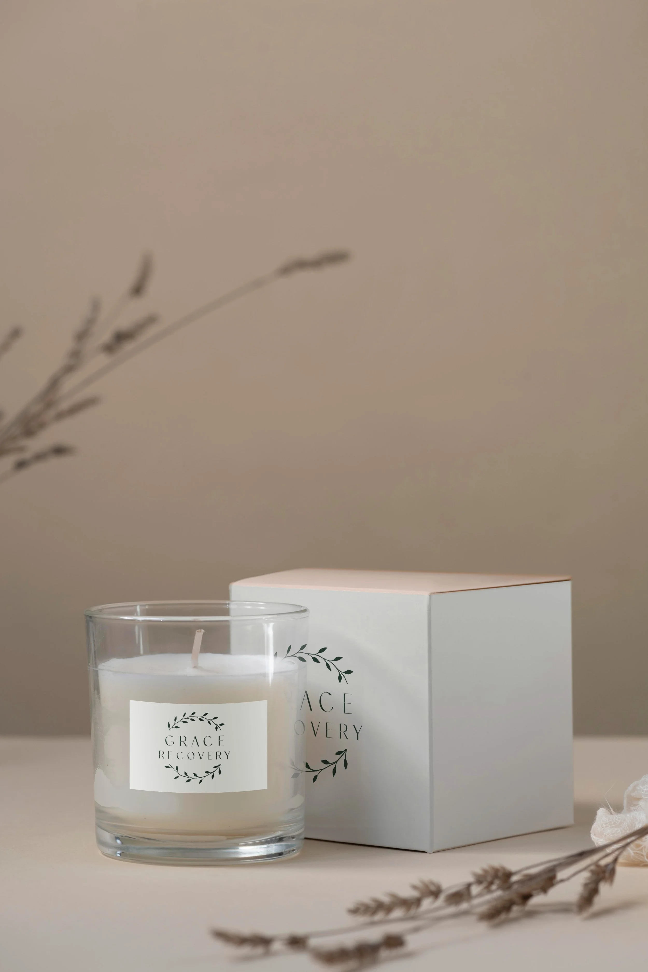
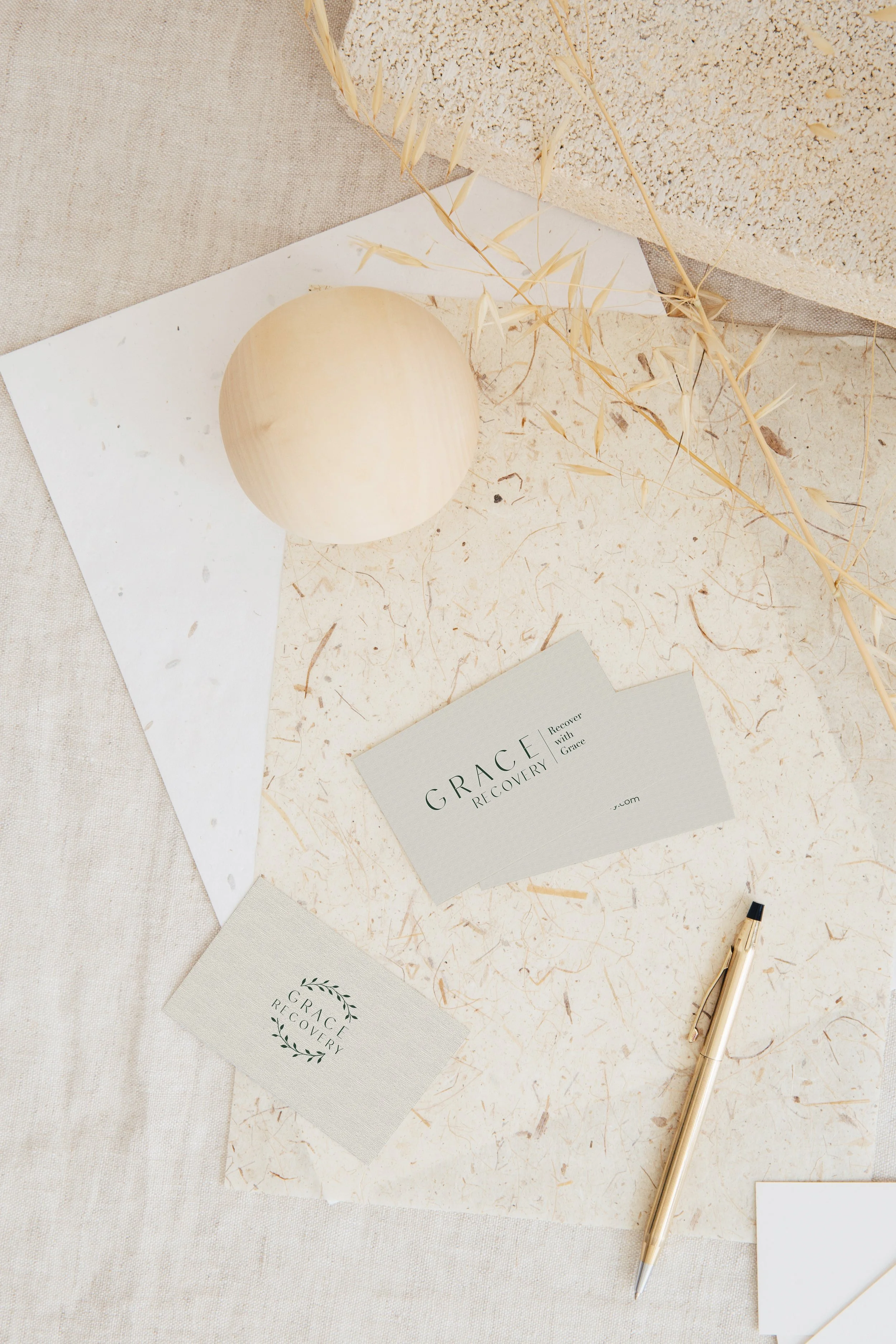
The Grace Recovery brand was designed to evoke a sense of quiet luxury, restoration, and refined comfort. A soft, earthy palette of sage greens, warm creams, and muted neutrals draws inspiration from the surrounding natural landscape, creating an atmosphere that feels both elevated and deeply calming. Organic imagery — gardens, sunlit fields, and thoughtfully styled interiors — reinforces the idea of healing within a serene, retreat-like environment rather than a clinical facility.
Typography and layout balance sophistication with softness. An elegant serif introduces a sense of grace and femininity, while clean supporting type ensures clarity and polish. Spacious compositions and layered imagery create a slow, immersive browsing experience that mirrors the pace of recovery and reflection. The overall digital direction positions the brand as an upscale, restorative sanctuary — a place where privacy, comfort, and personalized care come together to support lasting transformation.
Let’s create something
that’s yours.
No two projects are the same. If you’re ready for a brand and digital presence
that feels this considered, let’s start the conversation.