
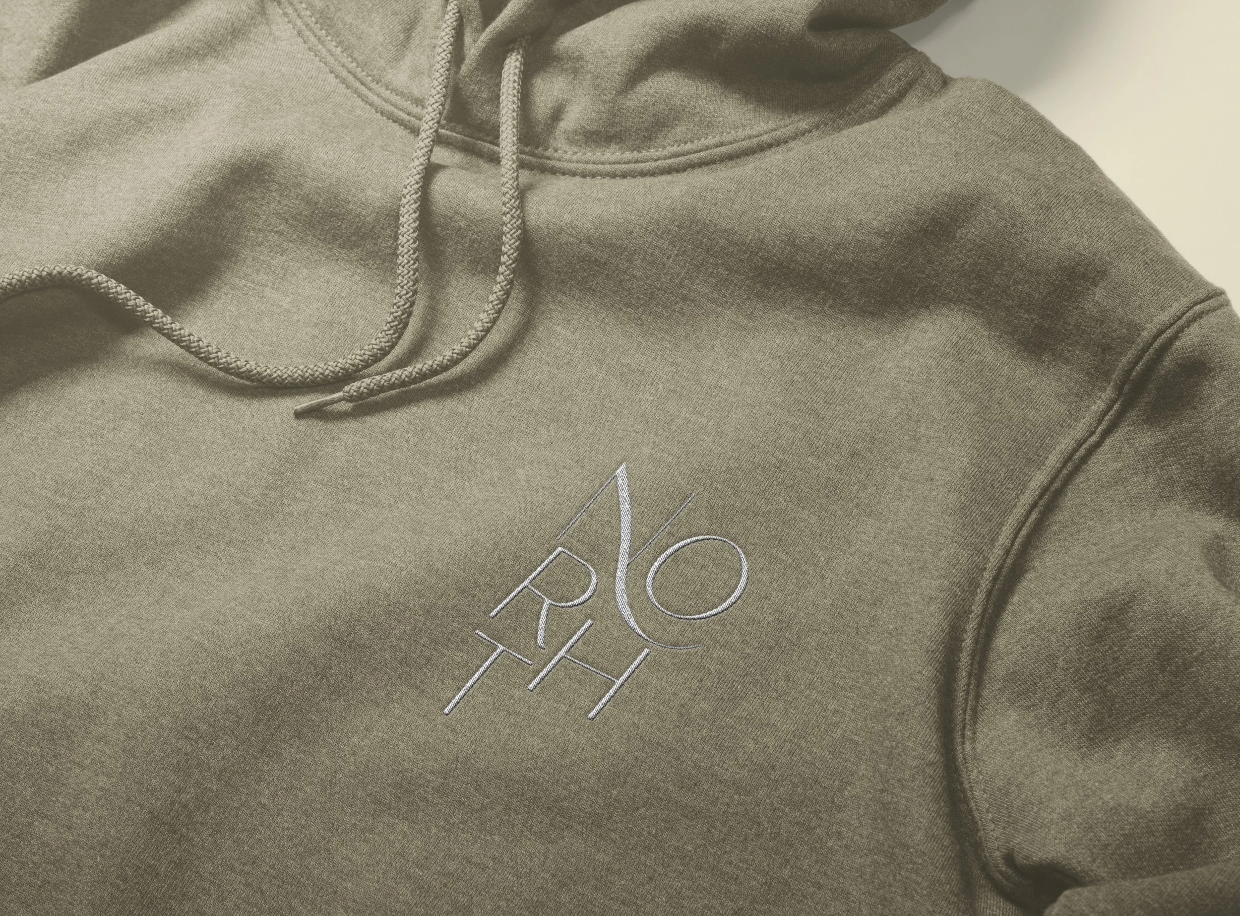
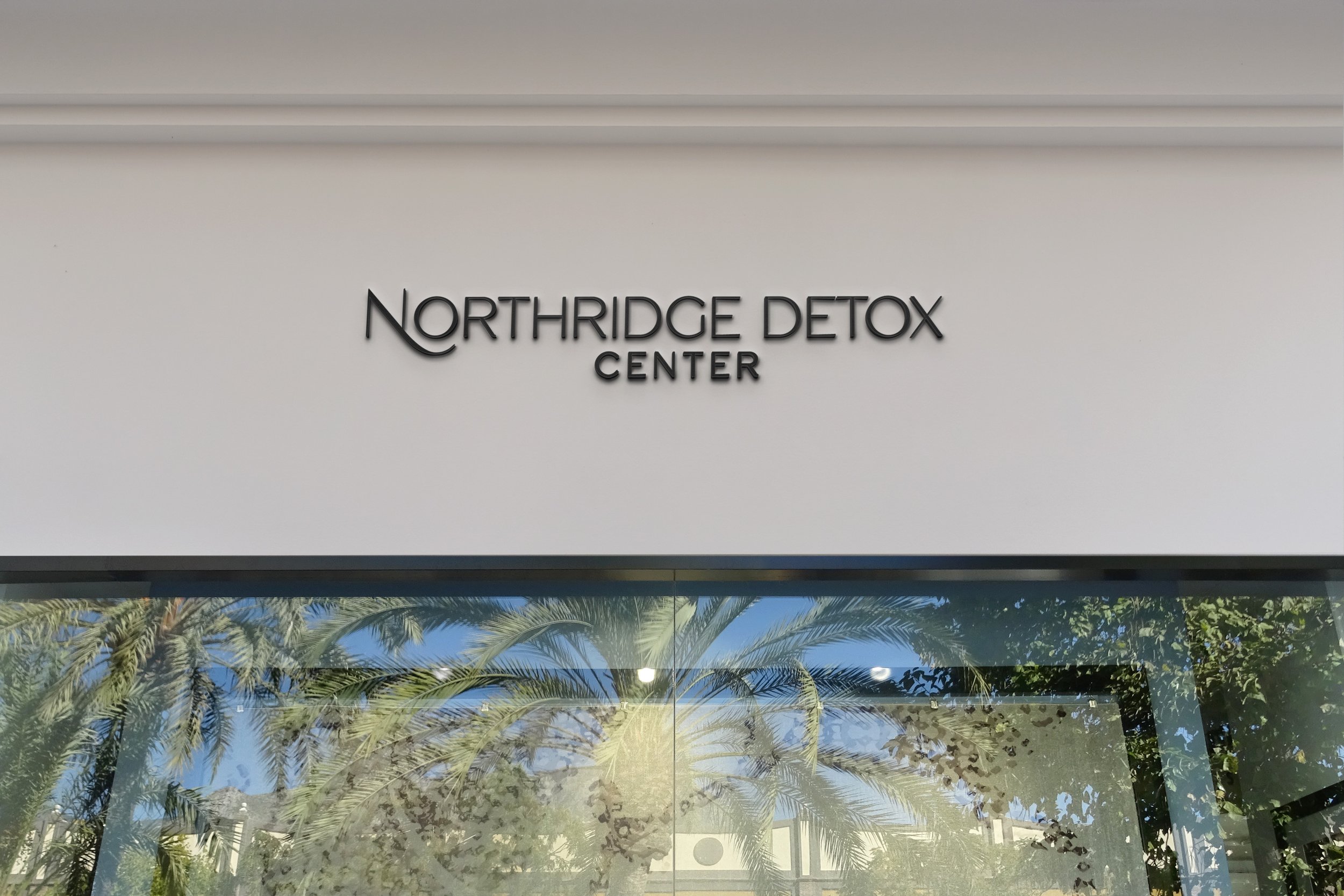
Northridge Detox Center
Clinical precision meets human-centered recovery
Brand & Digital Direction
The Northridge Detox Center website was designed to balance medical credibility with emotional reassurance — two essential pillars in early-stage recovery. A clean, structured layout establishes professionalism and safety, while a palette of deep rust, olive, and moss green introduces warmth, richness, and grounded stability — creating an environment that feels both clinically credible and emotionally supportive. Typography was selected to feel clear and authoritative without becoming cold, reinforcing trust at every touchpoint.
The hierarchy of information is intentional and direct, guiding visitors through services, admissions, and care philosophy with clarity during what is often a high-stress moment. Generous spacing and straightforward messaging create a sense of steadiness and control, reflecting the center’s commitment to medically supervised, compassionate detox care. The overall digital experience mirrors the brand’s mission: structured support delivered with dignity and humanity.
Let’s create something
that’s yours.
No two projects are the same. If you’re ready for a brand and digital presence
that feels this considered, let’s start the conversation.